About The Project
The Modern Cycle Company sells bikes on their web experience. They need to significantly enhance their browsing and checkout experience to improve their site usability.
Duration Time3 Weeks
Role
All UX research and UI design: competitive analysis, screener survey, research synthesis, guerrilla testing, user interviews, usability testing, A/B testing, user flows, low and high-fidelity prototypes.
The Problem
The PM has shared data showing that 50% of users open 7 item pages and then abandon the site without moving any items into the cart. The PM hypothesizes that users are unable to determine which bike is best based on relative features.
Additionally, 70% of users who place an item in the cart do not complete the purchase. Data shows that users abandon the cart at the registration page. Right now, users must make an account to purchase. The PM wants to design a guest checkout to solve this. The guest checkout must capture email.
Business Goal
It is to improve the conversion rate from browse to completion of checkout to increase revenue on the product’s web e-commerce experience.
User Interviews
I recruited participants from local dog parks. I Identified dog owners who were interested in doggy meetups. I conducted in-person interviews with five people.
Analyze & Synthesizing User Research
I started with a brainstorming of possible solutions and research questions.
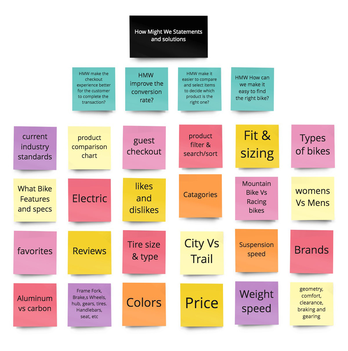
Research Questions
1. How might we make the checkout experience better for the customer to complete the shopping transaction?
2. How might we improve the conversion rate?
3. How might we make it easier to compare and select items to decide which product is the right one for the shopper?
4. How can we make it easy to find the right bike?
I began my research with competitive analysis and studied some e-commerce industry leaders for ways to increase conversion rates.
Competitive Analysis
I chose the below seven sites as examples for reviewing related products for solutions by analyzing competitors and other e-commerce industry leaders who have solved similar problems.
There are a ton of resources online about best practices for e-commerce optimization and how to increase conversion rates.
Industry Leaders
Walmart - I like the guest checkout and product filter they use.
Crate and Barrel - I like the guest checkout as an example.
Best Buy - I like the comparison chart and filter feature.
Amazon - I reviewed their comparison chart as an industry standard.
Walmart - I like the guest checkout and product filter they use.
Crate and Barrel - I like the guest checkout as an example.
Best Buy - I like the comparison chart and filter feature.
Amazon - I reviewed their comparison chart as an industry standard.
Competitors
Juiced Bikes - https://www.juicedbikes.com/
Citizen Bike - https://www.citizenbike.com/
Trekbikes.com - https://www.trekbikes.com/
Juiced Bikes - https://www.juicedbikes.com/
Citizen Bike - https://www.citizenbike.com/
Trekbikes.com - https://www.trekbikes.com/
They all have an industry-standard structure for retail sites. Most e-commerce websites have these main sections: Homepage, Search & Navigation, Category page, Product page, and Checkout.
Key Insights for Possible Solutions & Recommendations
After reviewing the research data, I feel the best solution would be to add product filter functionality, a product comparison chart with specs, and guest checkout. Presently the site does not have these features.
Target User for User Interviews
I recruited participants from a screener survey to find Modern Cycles' target users for future usability tests for the next phase.
They are:
• Users 24 - 38 years old
• The user base is 72% men
• High-income earners
• They take biking very seriously. They will spend a lot of money on this investment, so they are very picky and do their research.
Due to budget constraints and a short timeline, I was not able to interview the core market, but I set up interviews with several avid online shoppers and bike enthusiasts. Also, due to back-end issues, we won’t be adding the product filter navigation at this time.
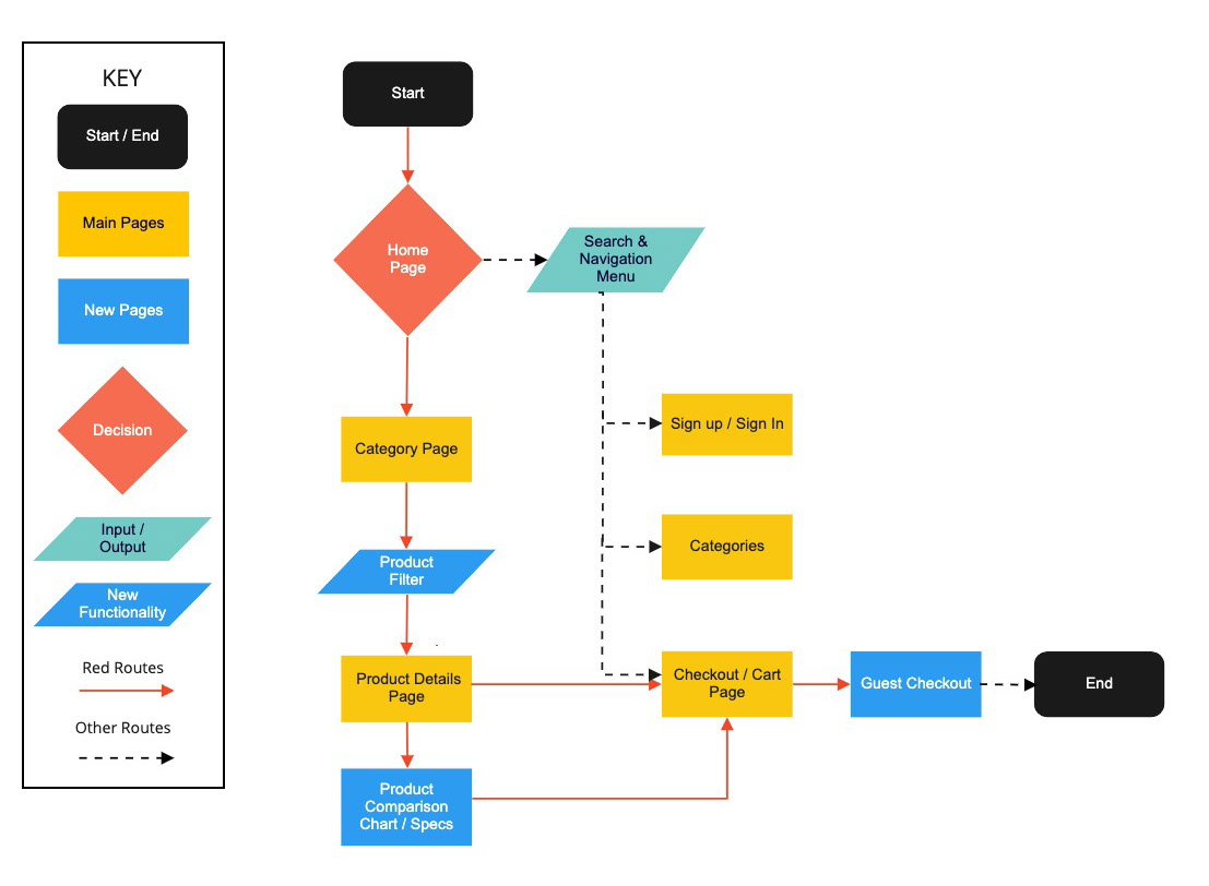
Mapping the User Flow
Here is the flow with the new pages and features to be added.
The Prototypes
The basic wireframes of the current site
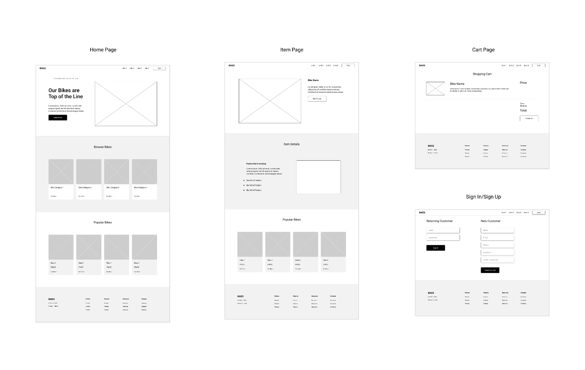
My high-fidelity prototypes used for testing.
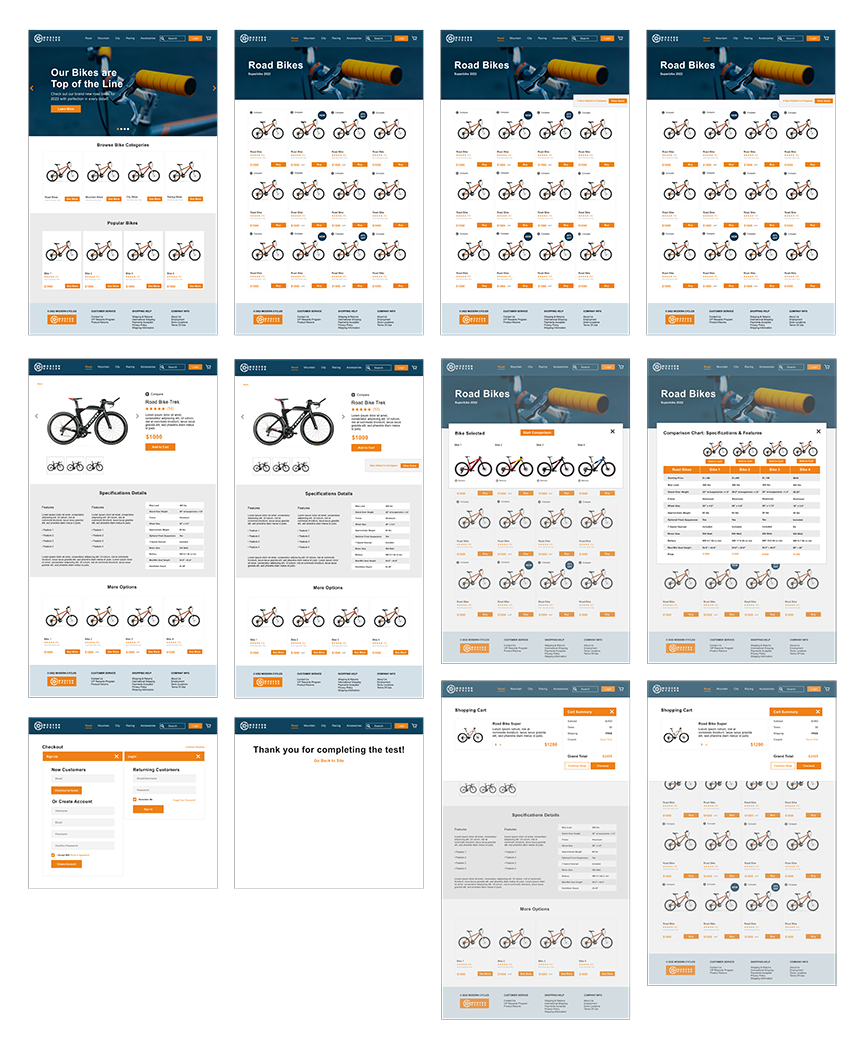
Category Page with Added Comparison Overlay
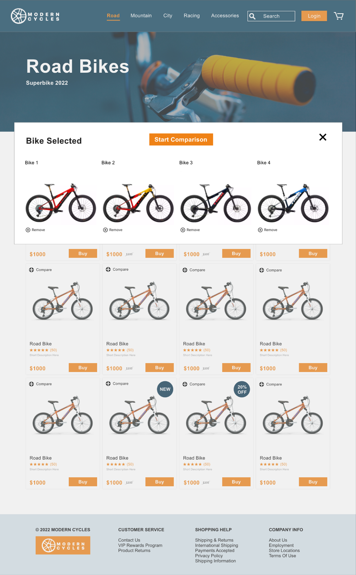
Added Comparison Chart with Bike Specifications

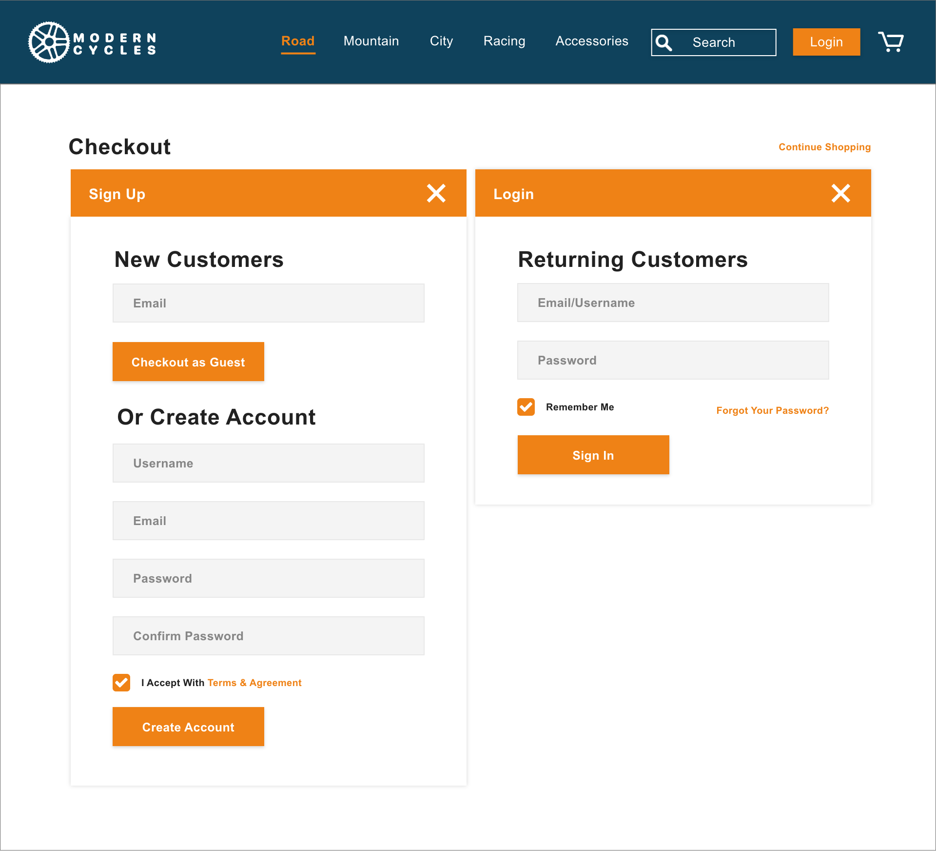
Added Guest Checkout
Usability Tests
My Findings from Two Rounds of Usability Testing:
I did in-person usability tests of the site with five online shoppers (twice), and this is my combined findings from 2 rounds of interviews:
1. I found it was better to test high-fidelity mockups because most people did not understand what they were looking at in the wireframe version. People need more detail to review the site, and it needs to feel more real.
2. Users would like filtering navigation (this is planned for in future iterations) to find the features they are looking for. This was something that they first looked for and were disappointed that the site did not have because that was a significant way for them to narrow down their search. This is a critical feature that needs to be included.
3. They liked the compare feature and would use it to determine the differences between bikes. When comparing bike specs, they wanted as many features as they could get to compare between to make an informed decision. The compare feature was a good add-on, especially without a product filter function.
4. I would reorder my product specs based on the user feedback on what was more important to them. Also, I'd add some more specs to the chart than what I initially used.
5. Many would not purchase the bike online until they tried it out the cycle at a store. They wanted to test ride the bike. This was a factor in their reluctance to buy the bike, especially when it was an expensive purchase. They might go to a store but then purchase the bike online to get more custom features they did not find in the store. (Like the color, gears, or the wheels.
6. They would like to see more product ratings, reviews, and recommendations on the product page. They were serious about researching the product before buying and seeing what other shoppers thought about the bike.
7. One of the main reasons they might abandon the cart at checkout was the shipping cost. They want free shipping. Shipping cost was an important factor in whether they would purchase the bike online vs. a store. I would put a free shipping banner on the homepage to display prominently.
8. They liked the guest checkout because many of them did not want to take the time to fill out the info to make an account or, for privacy reasons, did not want the site to have their personal information saved. For many shoppers, this was a one-time purchase. They did not mind giving out their email.
9. The participant liked the site's overall layout and found it to be a standard shopping and checkout experience. No major issues or complications with their shopping experience.
View the prototype here:
In Conclusion
I recommend adding a product filter to the site in the next iteration. This seemed to be a major ask from the users. As for guest checkout, it is an excellent way to streamline the checkout experience. I believe these additions to the site improved the cart abandonment issue.
I am pleased that the added site features were useful, and the insights I gathered did improve Modern Cycle's online shopping experience. I'm glad I researched what other e-commerce businesses have done for online shopping, not reinventing the wheel but making sure Modern Cycles had the current standard shopping experience in line with most major online retail stores.