About The DoggyDate App
The purpose of this app is to help pet owners connect with suitable playmate companions for their dogs. This project was developed during the beginning of Covid when all you could do was go to parks to meet up with friends outside with lots of social distancing. At the time, my friends all had dogs or newly adopted dogs or puppies.
Duration TimeSix months
Role
All UX Research and UI Design: User Survey, Competitive Analysis, User Interviews, Affinity Mapping, Empathy Map, Personas, Customer Journey Mapping, Usability Testing, User Flow, Sketches, Wireframes, Prototypes, High-fidelity screens, Visual Design and Branding
Problem Statement
How to connect pet owners who want to create social lives for their dogs.
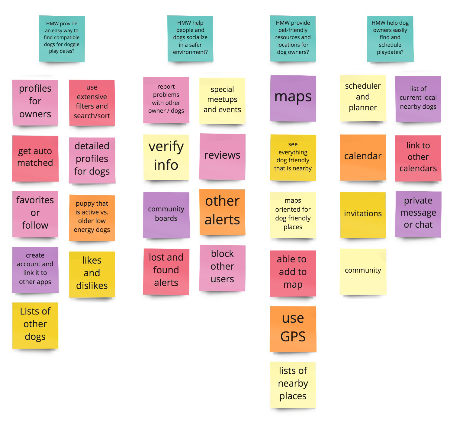
How might we
• Provide an easy way to find compatible dogs for doggie play dates.
• Provide an easy way to find compatible dogs for doggie play dates.
• Help people & dogs socialize in a safe environment.
• Provide pet-friendly resources & locations for dog owners.
• Help dog owners easily find & connect for playdates.
Analyzing & Synthesizing User Research
I started with a user survey. I conducted user interviews with 30 people and did a competitive analysis, and researched relevant concepts about why it's essential to socialize your dog.
User Interviews
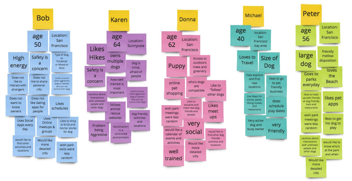
I recruited participants from local dog parks. I Identified dog owners who were interested in doggy meetups. I conducted in-person interviews with five people.
User Interview Participants
• Current dog owners
• Aged 20 to 70
• Use mobile phones
• Use social networking apps
• Live in the San Francisco Bay Area
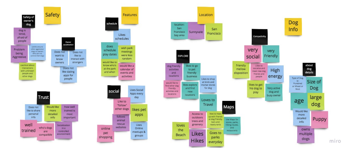
Affinity Maps
Participants kept mentioning similar topics. I grouped these topics into four main categories: Safety, Features, Locations, and Dog Info. The mapping process is further broken down into smaller groups: safety of owner's dog, owner socialization, trust, activities, social, explore, maps, dog details, and compatibility.
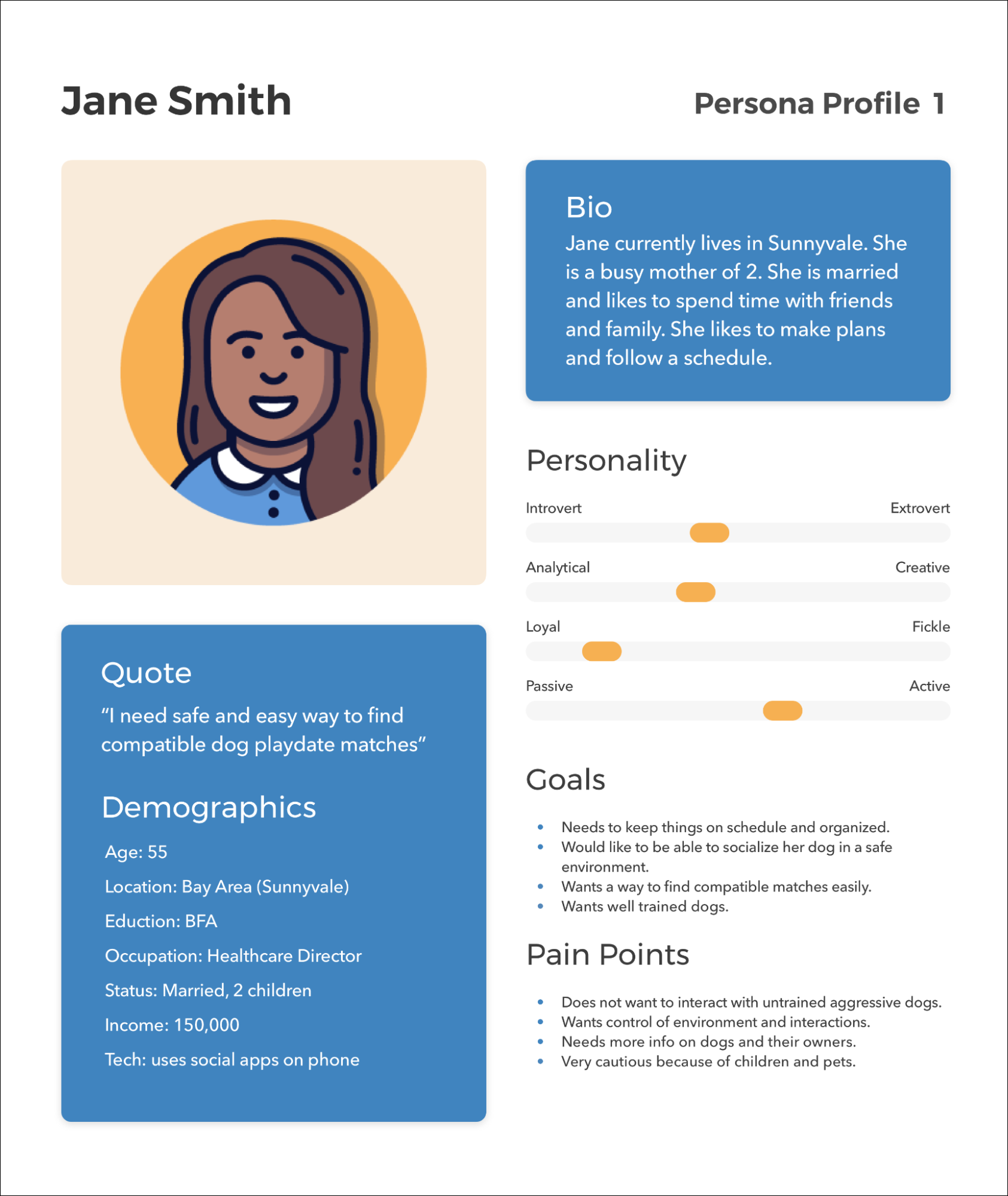
Personas
These two personas help me understand and empathize with the end-user's perspective of their goals and pain points. These personas are distilled-down versions of what I heard in interviews. One group (Jane) was interested in the social aspect, and one group (John) was more interested in the amenities and dog-friendly options.

Solutions
I went back to my "How Might We" questions and started brainstorming all possible solutions to help figure out the navigation and features needed. I also listed the different qualities that the dog owner might look for.
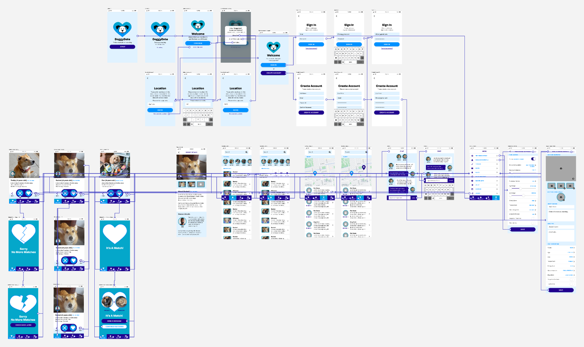
Mapping the User Flows
This user flow follows the main parts of the app that a user will take. It gives an overview of the user's steps from the entry point to the final interaction.

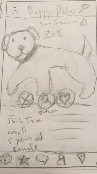
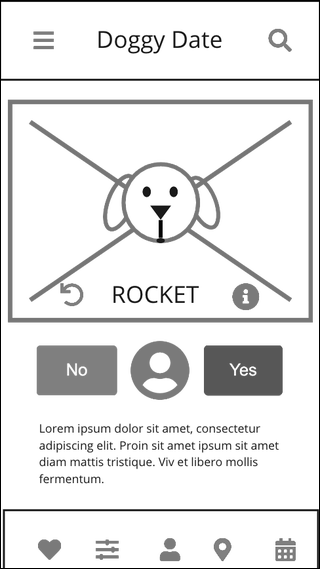
Initial Sketches and Iterations
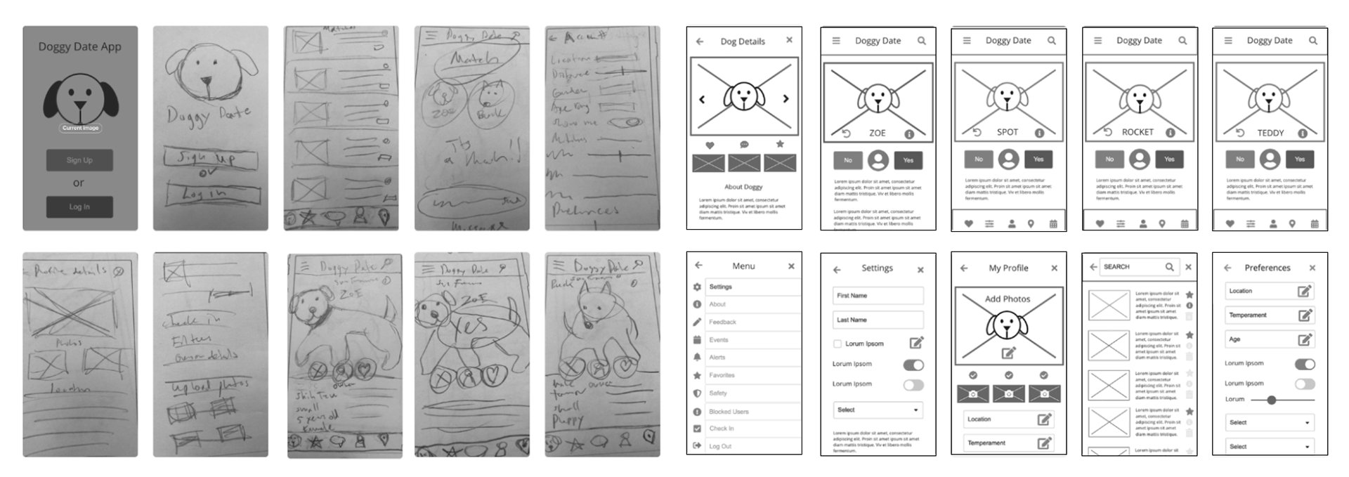
Wireframes & User Flow Mapping
My main focus was the app's usability with attention to its functionality so it would be intuitive to use. These are wireframes and user flow of my MVP (minimum viable product)

Usability Tests
I conducted a usability test using the guerilla testing method and made some discoveries and confirmations while testing my app. I asked eight dog owners to participate. I gave them a working prototype to try on any mobile phone.
I tested the app on a random group of 8 friends, family, and strangers from different backgrounds, ages, and locations (at restaurants, bars, parks, and cafes.) The task I set for them was to find matches for their dogs and how they would use the app to do that. I had people try out the prototype for about 15 minutes to verbally walk me through their impressions and give me feedback and suggestions for the app. The primary task was to discover what works and what doesn't work with my app.
I tested the app on a random group of 8 friends, family, and strangers from different backgrounds, ages, and locations (at restaurants, bars, parks, and cafes.) The task I set for them was to find matches for their dogs and how they would use the app to do that. I had people try out the prototype for about 15 minutes to verbally walk me through their impressions and give me feedback and suggestions for the app. The primary task was to discover what works and what doesn't work with my app.
Tasks:
1. First impressions.
2. Go through all the steps of onboarding. That includes location, sign in and creation of a new account.
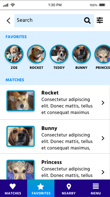
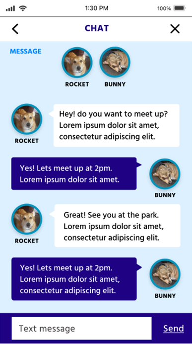
3. Explore the app to find a playmate match. Then connect with other dog owners: like using the chat feature.
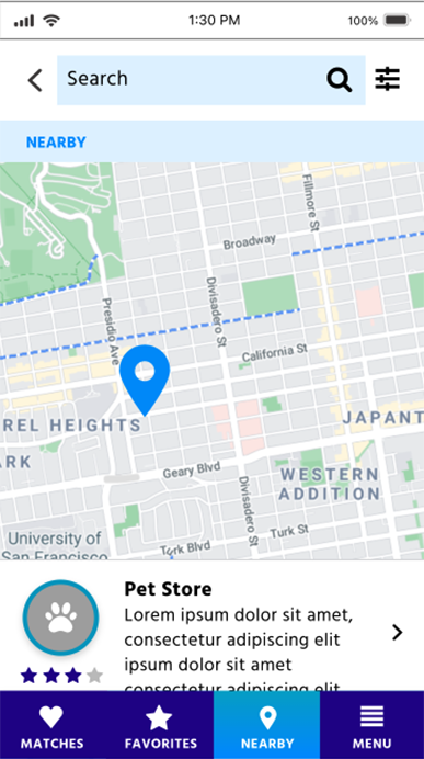
4. Explore the app's top-level features, such as the "nearby" map tab.
5. Overall impressions.
Usability Tests: 1st Round Prototypes
Some of My Findings after interviews:
1. Need to add an Introduction for the splash/login page or an onboarding walk-through.
2. Using labels and icons vs. just icons: Young tech-savvy audiences felt that they understood the symbols/icons used. However, older users thought icons were unfamiliar without labels.
3. Half of the participants wanted to see a photo of the owners on the main home page, and the other half wanted to see it on the dog details page. Half the users wanted this for use with their dogs, and others would like it to be both a dog and people dating app.
4. Search features like a drop-down menu of choice to filter. So would add more robust search terms etc.
5. Reordering: I would change the menu bar selection and reorder sections to improve the user experience.
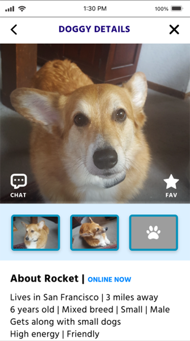
6. It seems that details like age, temperament, energy level, and getting along with people and other animals are essential for the main profile.
7. They would like the icons on the menu bar to be switched to Favorites/Likes, Chat, and Nearby/Map.
8. The Chat seemed to be a more popular feature than expected. Would add to be more prominent.
9. The Personal Account and Calendar could go into the menu section or be tucked away somewhere else.
I wanted to make sure the navigation was easy to understand and use.
Here is a before and after each test of several iterations of the home page:

Usability Tests: 2nd Round Prototypes
I conducted in-person interviews with five more people. I discovered I should:
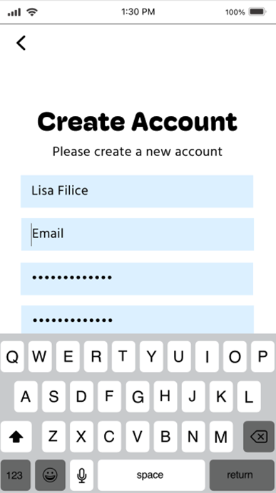
1. Add intro screens to Create Account.
2. Create Account needs to link to the "dog & owner profile" page. Change the link and add instructions to the profile.
3. Simplify visual design and verbiage. Add buttons to replace link text. Redesign the buttons and change wording.
4. Everyone completely missed the "Dog Details" page. Add an icon/button to the main profile screen to make it more noticeable. Add details icon.
5. Simplify top navigation. Have a back button only or search bar only.
6. Fix verbiage on Chat and Dog/owner profile page. Make copy edits.
7. Finalize animations on the "no more match" and "It's a match" page. Fix and add animations
8. Fix hot spots size. Redo hot spots to be more extensive touch areas.
9. Go through and clean up graphics and text. Clean up graphics and font line up.
10. Add swipe feature. It might not be possible with Adobe XD prototype
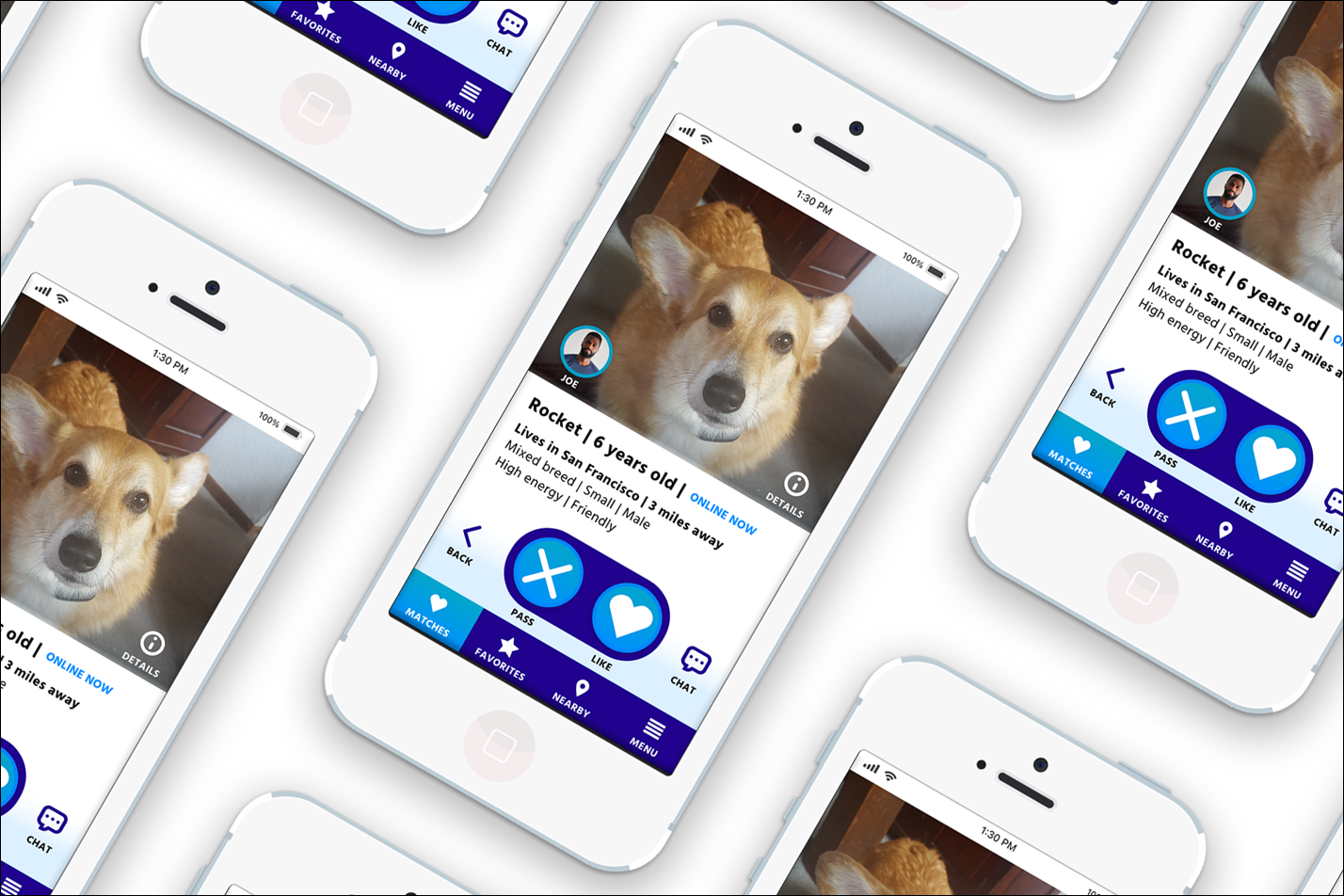
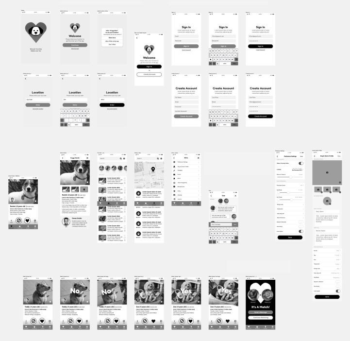
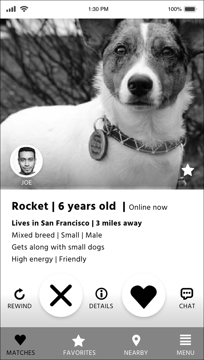
Prototype and High Fidelity Screens

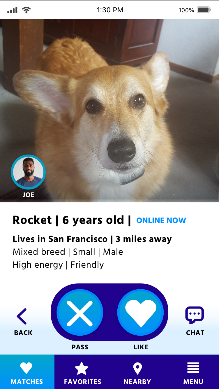
I designed the main screens to indicate all the available options and features to the user. I adopted already established conventions and patterns. Here are some before and afters of the homepage and splash screens after A/B testing:


Accessibility Audit
Accessibility issues I found during my audit caused me to revise screens and implement fixes for those with disabilities or functional limitations.
I identified for development or changed the following:
1. Change the colors and adjusted the foreground and background colors of branding for better visual accessibility and color contrast. Alternative text for Images and added labels to all icons to make it possible to read text and code in a way that is compatible with a screen reader.
2. I would add the ability for text resizing to the settings to make the text more readable in a larger size.
3. Add voice-controlled navigation
4. Add page titles to all subpages.
5. Fix traps: to get out of the screen or go back to the previous screen.
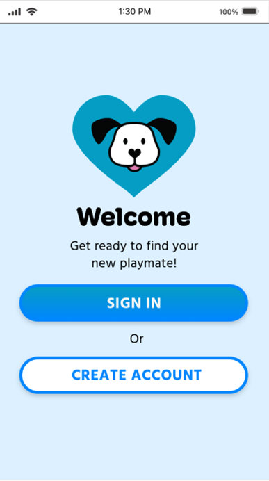
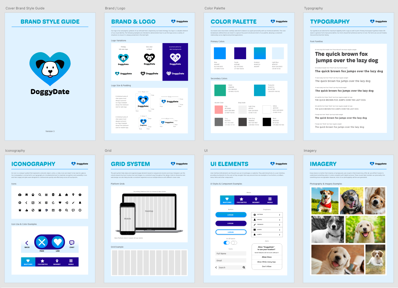
Visual Design, Identity & Branding
Since there was no company, I created all the branding for the presumed company.
Vision
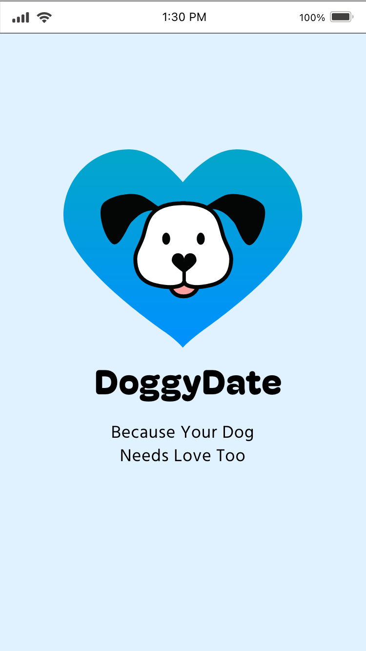
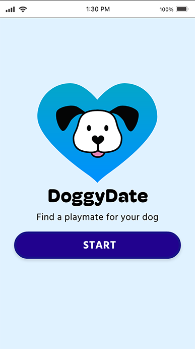
To find a compatible match for doggy playmates. Because your dog needs friends too, DoggyDate is a dog friend finder, an app like a Tinder alternative but for your dog. Great way to help socialize your pet and make new friends.
Tag Line
Because Your Dog Needs Love Too.
Brand attributes
Fun, Friendly, Joyful, Trustworthy, to feel a part of a community.
Rationale: I wanted to create something fun and easy to use and serve a social need.
Brand personality
Doggy Date would be Hello Kitty's best friend.
Rationale: I was inspired by hello kitty's aesthetics and how joyful dogs can be.
Moodboard and Inspiration

Final Brand Style Guide
Final Prototype
In Conclusion
The prototype was tested once again, and I found participants could complete all tasks given. However, users did mention they would like to see additional features.
I learned a lot during every round of testing. It was interesting to see how much of the design changed in each iteration and user test.
I found a few more areas to improve on in future iterations, such as...
1. It needs an onboarding introduction to using the app. Do a walk-through for new users.
2. Add titles for every page.
3. On the "Nearby" page, add tabs to the top for "pet stores," "parks," etc., for a more precise search of the map area.
4. Add the "Preference Settings" to the primary nav, not just hidden in the "menu" section.
5. Change the order of items in the "Dog and Owner Profile" by moving pictures below the "About" section. Also, add more instructions.
The DoggyDate app is different from another dating app because it is the pet, not the owner, who gets compatible matches. My app was designed to give users multiple dog-friendly options for selecting a companion for their pets with an easy-to-use interface.